Study: Arches National Park

Today’s Daily Art: Arches National Park Study #1 / Medium: Gouache / Daily Art Count: 36/100
Welcome back, color! And hello, gouache.
For the past month or so, I was really drawn to using black watercolor exclusively. I wanted to remove the variable of hue (color) and focus strictly on values (shades of white, black, and gray). In viewing lots of different kinds of art, I had noticed that I was really drawn to pieces with plenty of value contrast. Meaning, I love pieces that have good amounts of dark darks and light lights, with appropriate shades in between. However, I’d always struggled with this in my own work. So I decided to focus on just painting art with good value contrast in black and white.
I learned so much over the last 36 paintings! But I really missed my colors. So today, I decided to take what I had learned and throw a new medium, gouache, in for good measure. Gouache is a lot like watercolor, but it is opaque and allows you to work in layers.

Skillshare to the rescue… again
I decided to take a Skillshare class from one of my favorite artists and online teachers, Dylan Mierzwinski. Her Skillshare class, Get to Know Your Paint, has been really helpful in having some success with gouache, since I’ve never really used it before. She also talks about watercolor and acryla gouache. It’s a great class — all of her classes are so helpful!
Creating a color chart
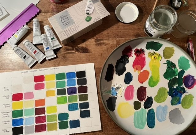
I have the Primary Color Set of Winsor & Newton Designers Gouache☞, so as Dylan suggested, I went about creating a mixing chart of the 6 included colors:
Zinc White
Ivory Black
Primary Red
Primary Yellow
Primary Blue
Permanent Green Middle.
I feel like I have a pretty intuitive sense of how to mix a particular color, but I really found that the color chart helped me to envision colors I wouldn’t normally reach for.

Practicing brush marks
Next, I practiced brush marks by using thick paint and paint thinned with water. I created a few pages of flower petals, stamens, and leaves. I really love the bold, vivid colors that gouache creates.
Putting it all together
Finally, because it’s the longest part of winter here in the Rockies, I have been drooling over photos of the Desert Southwest. I painted this study of Arches National Park today. I noticed that I tended to paint in more muted tones at first, but wasn’t getting the contrast I wanted. So I started picking out more vibrant hues based on their light and dark values. So in the shadows, you’ll see bold hues of magenta, cobalt, and red. This really livened up the painting and I’m really happy with it. I don’t think I would have had the confidence to try this if I hadn’t practiced so much with values.
This blog post contains affiliate links, denoted by the ☞ icon. What does this mean for you? Click here to find out.