Sherwin-Williams Celery: The 2027 Color of the Year, and the Wallpaper That Pairs With It
Stacie Humpherys
Rendering: Sherwin-Williams Celery beside a swatch of Western Birds and Flowers in Autumn Dusk.
Sherwin-Williams' 2027 Color of the Year is Celery (SW 6421), a soft herbal green with yellow undertones. HGTV Home by Sherwin-Williams chose it too.
If you like it but aren't sure yet, you probably have a few questions. Will a yellow-green look sour in your light? Will you still like it in five years? What goes with the floors and fixtures you already have? This post answers each one, shows the wallpaper I'd pair with it, and ends with an easy way to test it all before you commit.
This post is part of my Color of the Year 2027 series, where I pair each brand's pick with my wallpaper designs.
The short version: SW Celery is a light and fresh green with just a hint of yellow. Cool colors like slate blues and grays and a stormy purple make it feel crisp by bringing out Celery's yellow tones. Warm colors like cream, golden tan and wood tones will soften Celery. Decide which look you want, then pair from there.
Celery at a glance
| Name and code | Sherwin-Williams Celery SW 6421 |
|---|---|
| Color | Soft herbal green with yellow undertones |
| Announced | September 15, 2026 |
| Sherwin-Williams' palette | White Flour, Woven Wicker, Artichoke, Cocoon, Georgian Bay, Kirsch Red, Plum Brown, Potentially Purple, Cosmos |
| Works with | Crisp: slate blue, gray, stormy purple. Soft: cream, golden tan, warm wood |
| Wallpaper that pairs | Soft: First Light, Harvest Fog, Spring Thaw. Crisp: Gallatin Blue, Glacier Sage, Autumn Dusk. Tonal: Pale Rain, Fern Mist |
| Try it first | A paint sample beside a wallpaper swatch, swatches from $9 |

Celery and the nine colors Sherwin-Williams paired with it, in real paint chips.
What does Sherwin-Williams Celery look like?
Celery is a pale yellow-green, lighter and sunnier than sage, with an herbal softness that keeps it from feeling too much like lime green. On a screen it shows as roughly hex code #E0DDBD. Light reflectance value (LRV) is 71 out of 100.
To me, Celery looks like the moment spring turns to summer in the Idaho high desert. The wild grasses bake under the warm sun and turn from deep green to yellow, and Celery is that in-between color.
Put that color against a gray-purple thunderstorm on the horizon and you have one of my most favorite color combinations. It's also the color of aspen leaves halfway through turning yellow in the fall, which I watched happen at our cabin this year.
This is what Sherwin-Williams means by Reconnect: color rooted in a real place. For me, that place is the high desert Rockies of Idaho and Montana.


High desert grass and sagebrush under a summer storm in Idaho. I can almost smell this photo.
Because Celery has so much sunshiny yellow in it, the light in your room changes it more than it changes most greens. Warm afternoon light pushes it toward gold, and cool northern light pulls out the green. Test a paint sample in your own room before you commit.
Will I still love Celery in five years?
Probably, if you choose its partners on purpose. The yellow-greens people remember from the 1970s, avocado appliances and harvest gold, were darker and heavier. Celery is much lighter, closer to that first new garden growth than to an old kitchen appliance.
There's also a reason to think it will last. In July, Sherwin-Williams released its 2027 Colormix forecast, called Rewild, and named Celery one of its ten Continuity Colors, the shades it expects to last. Rewild is built on three ideas:
- Revive: heritage and craft
- Reignite: contrast and energy
- Reconnect: being rooted in place and nature
I love this because Pine + Feather Studio is built on those very same three principles. Every wallpaper and textile I design starts with heritage and craft, a real place and the natural world in it, and is based on solid design principles like contrast.
Revive is about heritage reinterpreted rather than copied. In the Rewild display, Celery sits beside Roycroft Bronze Green, named for the Roycroft community of the Arts and Crafts movement. That's the same tradition my Huckleberry Thief pattern comes from.

Rendering: Huckleberry Thief in Spring Thaw, the colorway I drew around Celery.
Green also keeps coming back as a color of the year, from Evergreen Fog in 2022 to Behr's Grounded this year. Nature trends from time to time, but it never really goes out of style. There's even research behind why it feels good to live with, which I'll cover in my upcoming Color of the Year 2027 field guide.
How do you want Celery to look?
Crisp, soft or tonal. Celery changes with what sits next to it, so decide on the look first and choose its color partners from there.
Crisp and bright, with more yellow
 SW Celery
Georgian Bay
Plum Brown
Potentially Purple
Pair it with slate blue, cool gray, stormy purple, navy
Like grass against a summer storm.
Shown: Glacier Sage
Soft and mellow
 SW Celery
White Flour
Woven Wicker
Pair it with cream, golden tan, warm wood
Like dry grass in late afternoon light.
Shown: First Light
What the color wheel says about Celery
Celery sits between yellow and green on the color wheel, and where a partner sits on the wheel predicts how the two will look together.
- Neighbors blend. Yellows, golden tans and other greens sit next to Celery on the wheel and share some of its yellow, so together they read soft and calm. These are analogous colors.
- Opposites glow. Straight across the wheel is red-violet, the plum of a summer thunderhead. Opposites, or complementary colors, make each other look stronger, which is why yellow-green grass looks so vivid under a purple sky. Red and violet, on either side of the opposite, give a gentler version of the same contrast.
- Cool gray acts cool. It isn't on the wheel, but next to it Celery looks warmer and more yellow.
Sherwin-Williams' Rewild forecast calls this kind of energy Reignite, and one designer in it describes it as "joyful friction." Celery under that plum-colored desert thunderstorm is exactly that.

What colors go with Sherwin-Williams Celery?
Sherwin-Williams built a nine-color palette around Celery, and most of it is out there in the high desert in early summer. If you're keeping a floor, counter or sofa, find its closest color here. That tells you whether you're heading toward the crisp look or the soft one.
| Pair Celery with | Sherwin-Williams color | Where it is in the landscape | The effect in a room |
|---|---|---|---|
| A warm white | White Flour SW 7102 | Sunlight on the clouds | Light and clean, the easiest pairing |
| A woven tan | Woven Wicker SW 9104 | The dry grass on the valley floor | Golden and earthy |
| A deeper green | Artichoke SW 6179 | Sagebrush in shadow | Tonal, layered greens |
| A deep blue | Georgian Bay SW 6509 | The far mountains under the storm | Crisp contrast, the way Sherwin-Williams shows Celery cabinets beside a deep blue |
| A plum-brown | Plum Brown SW 6272 | The darkest storm clouds and the rock outcrops | Moody and warm, Sherwin-Williams' own dining room pairing |
| A pale lavender | Potentially Purple SW 6821 | The lavender haze where the rain meets the far hills | Light, airy contrast. For the full storm look, pair Celery with Plum Brown |
The palette also includes Cocoon SW 6173, Kirsch Red SW 6313 and Cosmos SW 6528.

What wallpaper goes with Celery green?
Choose the wallpaper for the look you want. Each colorway below was drawn around named paint colors, but test them in your own light, because ink on paper and paint on a wall never look exactly alike.
Torn between two looks? Order a swatch from each and tape them up side by side in your room. It's much easier to choose on the wall than on a screen.
Soft and blended: warm grounds let Celery melt into the paper.
SW Celery
Creamy ground, buttercream florals, moss green leaves and terracotta berries. The easiest partner for Celery trim or cabinets.
 SW Celery
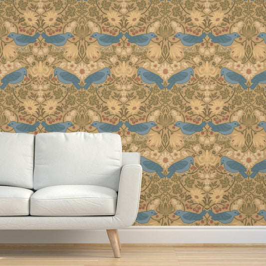
Seafoam birds on a warm golden tan, the dry-grass side of Celery.
 SW Celery
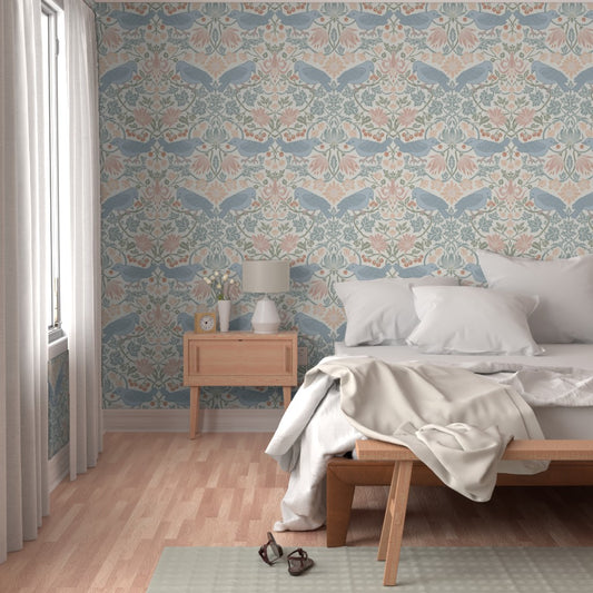
Duck-egg birds and madder rose blooms on a light green ground drawn around Celery.
 SW Celery
Coral, teal and gold hummingbirds on a warm sage. The coral nods to Kirsch Red.
 SW Celery
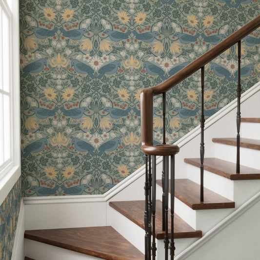
Deep graphite-green birds and botanicals on warm cream, the crispest of the soft options.
Crisp and bright: blue or plum makes Celery read sunnier, like grass against a storm.

 SW Celery
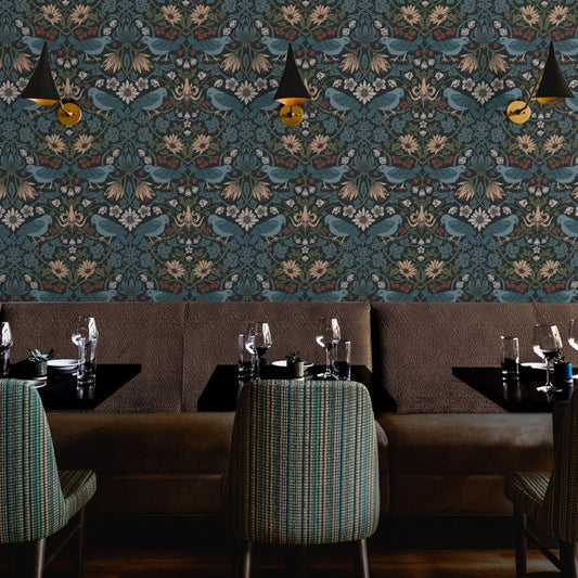
Cream birds and florals on a plum-brown ground, the storm cloud from across the color wheel. It makes Celery glow.
Quiet and tonal: a similar green, just a little grayer.
 SW Celery
Cream birds on a soft gray-green. Celery looks like its sunnier cousin.
 SW Celery
Moss-green birds on the same gray-green ground, a layered all-green look.
Under a Celery ceiling: my cream-ground Wild Yellowstone toiles sit easily below it.
 SW Celery
Teal bison, elk and mountain landscapes on warm cream.
 SW Celery
Charcoal wildlife on warm cream, the most classic of the three.
 SW Celery
Warm tan wildlife on soft cream, the gentlest partner for Celery.
The paint chip on each one shows Celery at its hex value on screen. Your monitor and your room will shift both, so order the swatch before you decide.

Rendering: Celery cabinets and bench with Wild Yellowstone in Gallatin Blue.
Where does Celery work best?
Ceilings, cabinets and small rooms where you can have some fun. These are the places I'd try it.
A powder room. It's a small room you pass through, so it's the easiest place to say yes to the print you really love. Paint the vanity or trim Celery and wallpaper all four walls, so the pattern wraps the room instead of stopping at one wall.
On the ceiling, above a wallpapered wall. This is my favorite way to use it. Paper the wall behind the bed or the whole room, paint any plain walls a warm white like Sherwin-Williams White Flour, and put Celery on the ceiling and trim. The room gets color from above without feeling enclosed.

Rendering: Celery on the ceiling and trim, White Flour on the walls, and Western Birds and Flowers in Pale Rain behind the bed.
A breakfast nook or sunroom. Celery on the banquette, cabinets and window trim, with Spring Thaw on the walls. Spring Thaw is a new colorway of my Huckleberry Thief pattern, and its light green ground was drawn around Celery, so the paint pairs with the paper while the duck-egg birds and madder rose blooms do the talking.

Rendering: Spring Thaw wallpaper with Sherwin-Williams Celery on the banquette and trim.
Cabinets with a deep blue. Sherwin-Williams shows Celery cabinets against a dark blue backsplash, and Georgian Bay from the palette gives the same contrast. The idea works in a mudroom too, with a navy toile like Gallatin Blue.
A dining room with a plum door. Celery walls, a Plum Brown door, and River Slate wallpaper above a chair rail.
A small dose on wood walls. In a room paneled in wood, a framed wallpaper swatch with a Celery mat brings in the color without painting anything. That's how I'd bring it into our cabin bedroom, where the walls are wood.
Renting? A Peel & Stick panel in a warm colorway, plus Celery in textiles, gets the look with nothing to undo. My renter-friendly wallpaper guide walks through the options.
Not sure yet? Start where it's easy to change: a ceiling, a door, a vanity or a set of chairs. A wallpaper with Celery in the pattern is another way in, with no painting at all.
How big a commitment is this?
Smaller than it feels. Paint is the easy part to change, so a Celery ceiling, door or vanity is a low-risk place to start.
For the wallpaper, choose the material by how long you want it up. Every design in this post comes in both, so you can pick the paper you love first and the material second.
- Pre-Pasted is made for the long haul. It's fully removable, breathable, and mold and mildew resistant, which helps in a powder room. It hangs with water on a primed wall, so you can hang it yourself or hire a paper hanger.
- Peel & Stick is the lighter commitment. It's designed for up to a year on the wall and is fully removable within that year.
Each one has a step-by-step guide: hanging Pre-Pasted and hanging Peel & Stick. When you're ready for rolls, my wallpaper calculator works out how many you need, pattern repeat included.
How do I test Celery with wallpaper before I commit?
Tape a painted Celery sample beside a wallpaper swatch where they'll actually live, and check them in the room's light for a few days. Also hold them next to whatever you're keeping, like tile, a counter or a sofa, and decide whether you like the contrast or want something softer.
- Get a real paint sample. Roll a big patch right on the wall, or paint a sheet-sized piece of cardstock if you'd rather not touch the wall yet. A small chip is too small to judge a light color.
- Order two to four swatches, one warm and one cool if you're unsure. Mine are 24 by 12 inches on the same material as the roll.
- Tape them side by side on the wall or ceiling they're meant for. For a ceiling, hold the sample overhead, because light hits a ceiling differently.
- Look morning, afternoon and by lamplight. Celery shifts toward gold in warm light.

Rendering: Sherwin-Williams Celery rolled on the wall beside a 24 by 12 inch Spring Thaw swatch.
If Celery caught your eye, give it a fair try. You don't have to decide today. Start with one paint sample and a couple of swatches, live with them for a few days, and let your own room show you which look is yours.
Build your own color test

One paint sample from the store, plus four wallpaper swatches from me. Four swatches take 15% off automatically, and they all ship free.
Every swatch is 24 by 12 inches on the same material as the roll. Order any swatch and I'll email you a $20 credit toward your first roll order of $200 or more.
Common questions
What is Sherwin-Williams' Color of the Year for 2027? Celery, SW 6421, a soft herbal green with yellow undertones. Sherwin-Williams announced it on September 15, 2026, and HGTV Home by Sherwin-Williams chose it as well.
Will Celery go out of style? It's a light, nature-based green, and Sherwin-Williams named it one of ten Continuity Colors in its 2027 forecast, the shades it expects to last. Classic partners like cream, warm wood or a deep blue help it feel at home for years.
Is Celery green or yellow? It's a light green with a lot of yellow in it. In warm light it leans golden. In cool light the green comes forward.
What colors go with Celery green? Warm whites, golden tan, warm wood, plum and deep blue. Sherwin-Williams' palette for Celery includes White Flour, Woven Wicker, Georgian Bay and Plum Brown.
Does Celery go with gray? Yes, if you want contrast. Cool gray makes Celery look brighter and more yellow, the way grass looks against a storm. If you'd rather Celery look soft and mellow, pair it with cream and warm wood instead.
Can you paint a ceiling Celery? Yes. It's light enough to use overhead, and a Celery ceiling above warm white walls and one wallpapered wall brings color into a room without making it feel smaller.
What wallpaper goes with Celery? It depends on the look you want. For soft and blended, try First Light, Harvest Fog or Spring Thaw. For crisp contrast, try a blue like Glacier Sage, a navy like Gallatin Blue or a plum like Autumn Dusk. For quiet and tonal, try Fern Mist or Pale Rain.
Is Sherwin-Williams Celery the same as HGTV Home Celery? Yes, it's the same color. HGTV Home by Sherwin-Williams sells it as Celery HGSW2237, so the code on the can is different from SW 6421.
Can I take the wallpaper down later? Yes. Pre-Pasted is fully removable, and Peel & Stick is fully removable within a year of hanging it.
Sources
- Sherwin-Williams, Color of the Year 2027: Celery SW 6421 (palette and codes)
- Sherwin-Williams, SW 6421 Celery color page (hex and LRV)
- Sherwin-Williams, 2027 Colormix Forecast: Rewild
- Sherwin-Williams, Get to Know Rewild: A Q&A Guide to the 2027 Colormix Forecast (Continuity Colors)
- Sherwin-Williams STIR, Inside the Making of Rewild ("joyful friction," Amanda Steinert Francfort)
- Homes & Gardens, Sherwin-Williams Color of the Year 2027 (announcement date and room examples)
- Roger S. Ulrich, "View through a window may influence recovery from surgery," Science, 1984